KDC is a children's design studio under ZVINE, with a focus on children's design research. In the early stages, the VI was relatively simple. As business expanded, we hoped that KDC could convey more of our ideas through its brand.
Therefore, during the gaps between projects, the team worked on the visual aspects of KDC, from defining the design philosophy to expressing it visually. The process involved conceptualization, thinking about the children's brand, and the expression of children's visual language.

For the visual presentation of KDC, we aim for a modern, clear, and distinct style. "Modern" means it should be current, understandable, and appealing to children while also being appreciated by adults. "Clear and distinct" means identifying our unique characteristics and expressing them clearly.
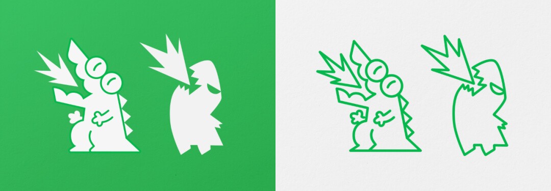
For visual exploration, the team want to solve general issues, such as how to convey children's emotions through visuals, in conjunction with a specific design style. How to define and expand upon a small IP character, and so on.

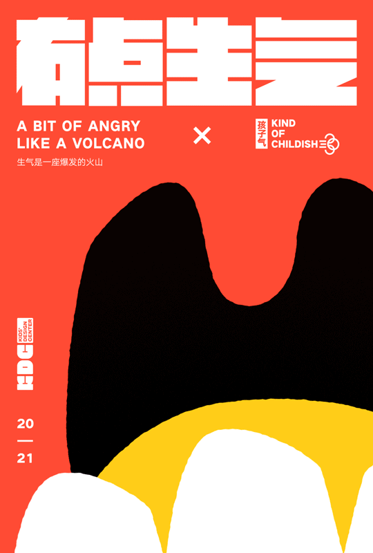
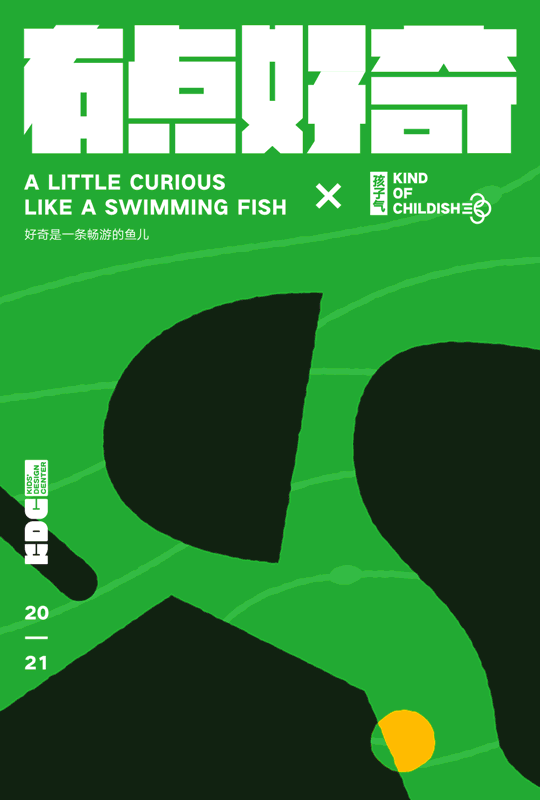
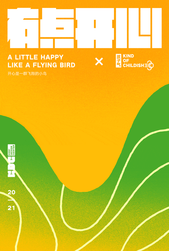
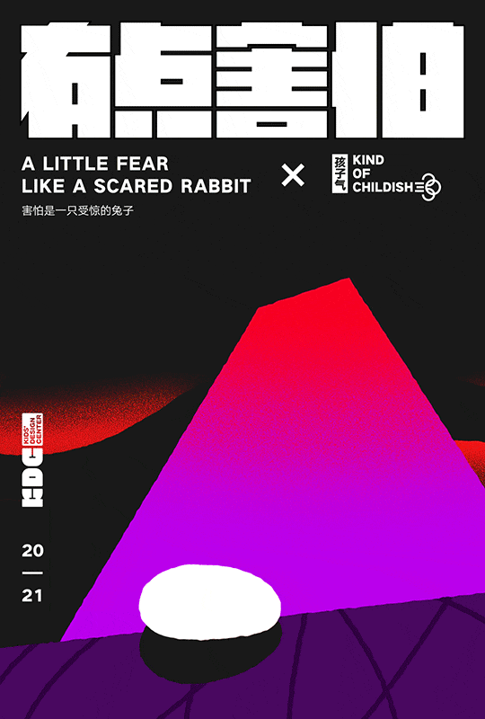
As an example of visualizing children's emotions, designers observe children's behaviors, sounds, and states, recording these abstract descriptions, and then expressing them through shapes, animations, and colors.


Here are descriptions and visual representations for the four emotions: anger, curiosity, happiness, and fear.
A little anger Like a volcano
A little curious Like a free-swimming fish
A little happy Like a flying bird
A little fear Like a cautious rabbit
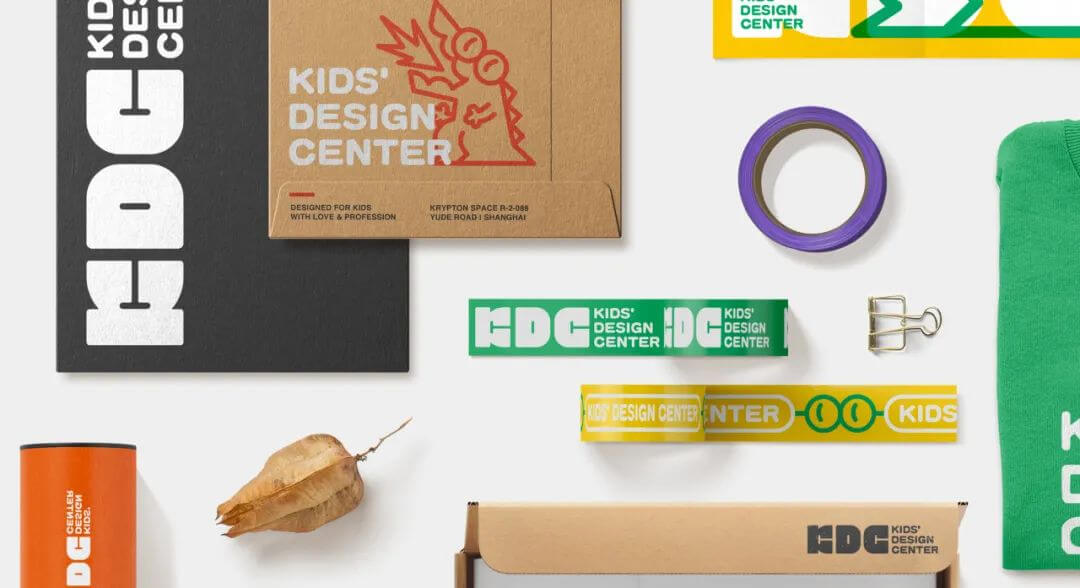
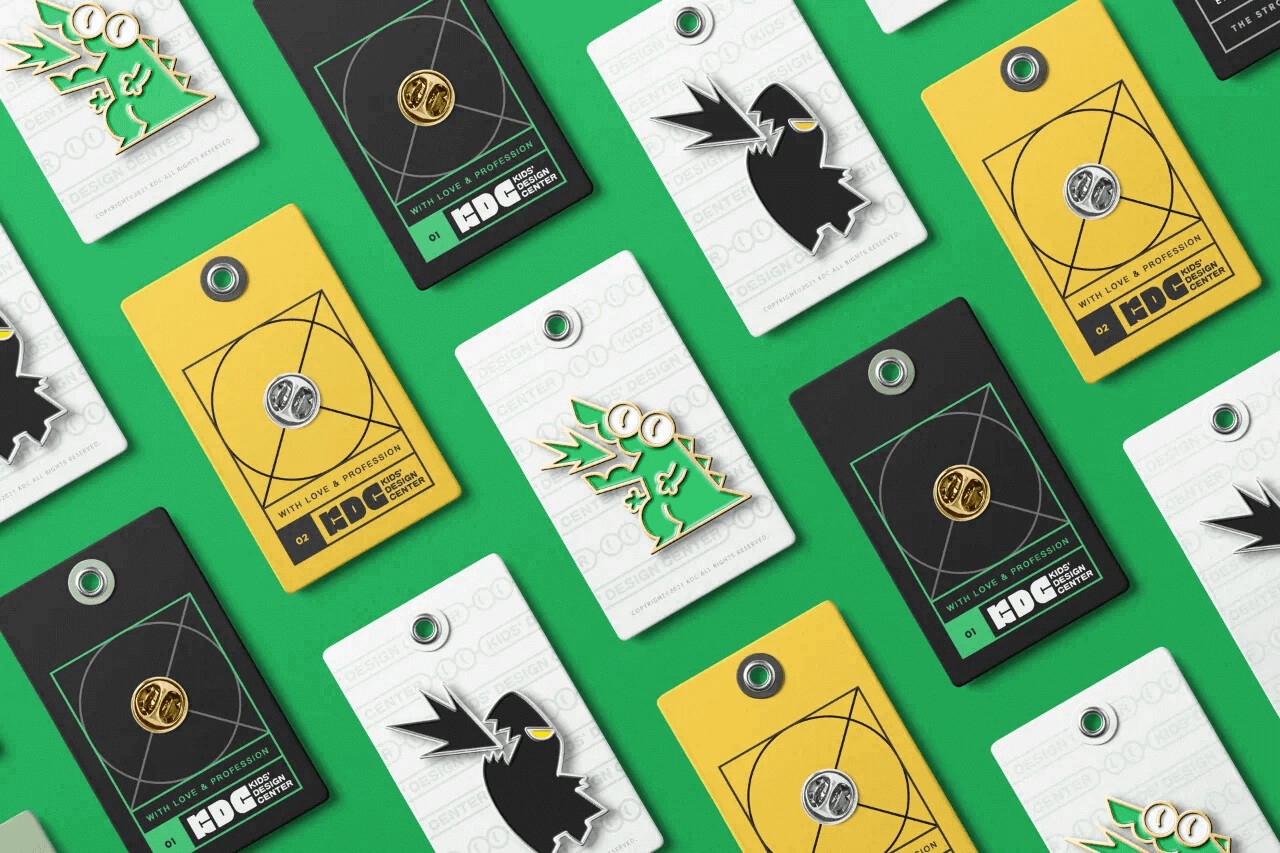
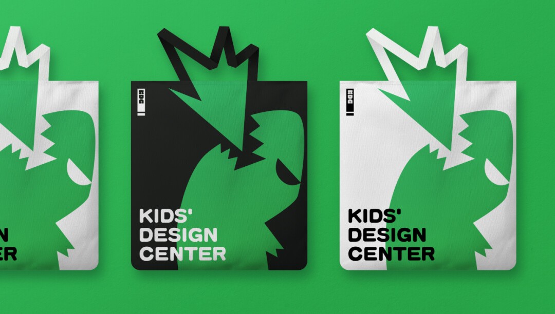
Based on the entire style, we have made updates to KDC’s VI.